Pure & Simple
Often times, less is more – JRINK
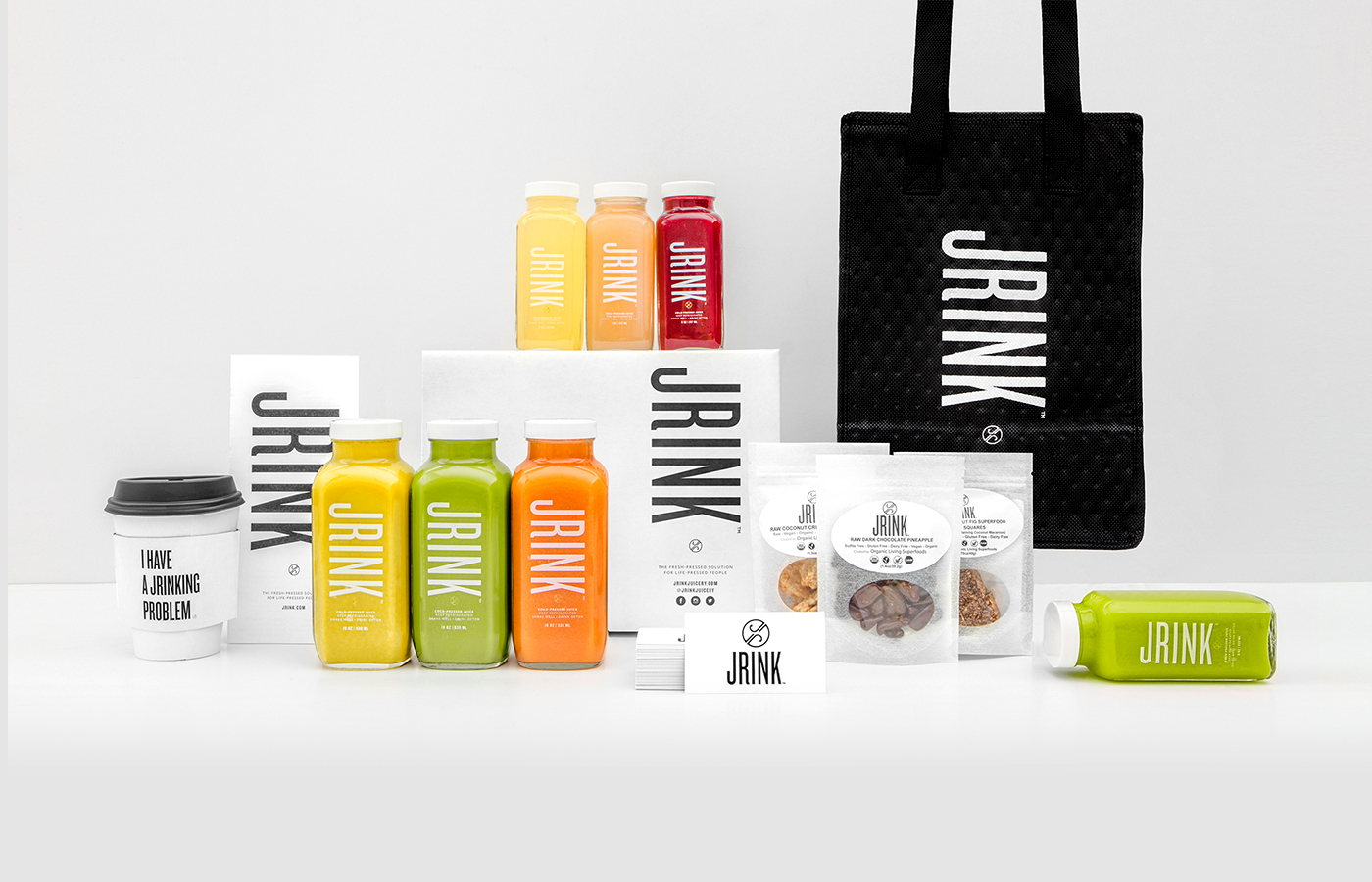
JRINK Juicery is a cold-press juice bar and delivery service that sources the highest quality ingredients and juicing methods to provide more nutrients in each bottle.


Approached by JRINK Juicery, our challenge was to rebrand and reduce packaging costs while still keeping their farm-to-bottle mission in mind. The client proposed moving from glass bottles to plastic. However, plastic went against everything the brand stands for — organic, sustainable, and eco-friendly.


Instead, we recognized extra costs came from printing individual ingredients and flavors on each bottle. We devised a plan to print a simplified label that could be placed on the caps, eliminating additional costs for printing on the bottles. We chose white for their packaging, de-cluttered their labels, and redesigned the logo to let the color of the juices speak to customers.


We redesigned their boxes and packing tape to reflect the pure and simple product. For the JRINK brand, we recognized that less is more.

We extended the new branding across social channels to reflect the healthy, socially-conscious lifestyle of JRINK. The new brand personality has generated major buzz and engagement across all social channels, growing brand awareness and increasing followers.